How to Make a Graph on Google Sheets Without Hassle
Learning how to make a graph on Google Sheets is one of the most useful skills for anyone working with spreadsheet data. Have you ever worked on a spreadsheet with a clustered appearance that makes you wonder if your recipients will ever understand the information conveyed therein? That’s why you need a chart to simplify the readability and present your data in a visually compelling way.
Thankfully, Google Sheets has the option to insert graphs and charts in a spreadsheet, which helps present your work differently and make it more intelligible. Inserting graphs in Google Sheets is relatively easy — you’ll be up and running with just a few clicks, regardless of your experience level.
Read on below to find out how to go about it!
Prepare Your Data Before Making a Graph
Before you insert a chart, it pays to spend a moment organizing your spreadsheet. Google Sheets reads your data structure to build the chart, so a well-prepared dataset means fewer corrections afterward. Keep the following checklist in mind:
- Put labels in the first row or column. Sheets uses these as legend entries and axis labels, so clear header names matter — for example, use Month rather than Column A.
- Keep related values in adjacent columns. A layout like Month | Sales or Product | Jan | Feb | Mar makes it easy for Sheets to identify each data series automatically.
- Remove blank rows or columns inside your dataset. Gaps in the middle of your data can confuse the chart engine and produce incomplete or broken graphs.
- Make sure numbers are stored as numbers, not text. If a cell shows a number but is formatted as text, Sheets may ignore it or plot it incorrectly. Check by selecting the cell and confirming the format in the toolbar.
- Keep category names consistent. Mixing formats — for example, using “Jan” in some rows and “January” in others — will create duplicate entries on your axis.
Taking these steps before inserting a chart saves you from troubleshooting a broken or misleading graph afterward.
How to Make a Graph on Google Sheets: Inserting Your First Chart
Google Sheets allows you to create and insert different types of graphs, from advanced radar charts to the basic line and bar charts. Knowing how to make a graph on Google Sheets opens up a wide range of visualization options for your data. To create a graph of your choice, follow the steps below:
- Open a spreadsheet on Google Sheets
- Highlight the full data range you want to graph, including the header row. For example, click cell A1 and drag to C10 to select the range A1:C10. Skipping this step can cause Sheets to include the wrong cells, omit entire columns, or generate a chart that doesn’t reflect your data.
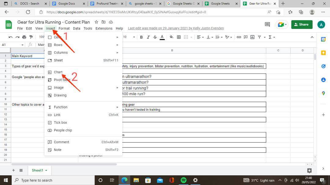
- Navigate to the top menu and click Insert
- Select Chart from the options to open the Chart Editor tool
- Review the auto-generated chart that appears on your spreadsheet. If you’re satisfied with it, you’re done with this step. If the chart looks wrong — for example, it’s missing rows or columns — open Chart editor > Setup > Data range and enter or select the correct range to fix it.
It is worth noting that Google Sheets will automatically detect the range of your selected data and suggest the most appropriate chart type. You can always adjust this selection manually using the Chart Editor panel on the right side of your screen.
Fix the Chart’s Data Range, Headers, and Rows/Columns
Created a chart but something looks off? Maybe the legend is showing “Series 1” instead of real labels, or your months are appearing as separate data series rather than along the X-axis. Here’s how to fix the most common data issues from inside the Chart Editor:
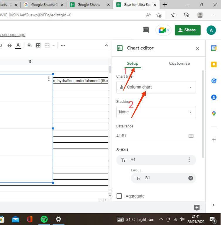
- Change the data range: Double-click the chart to open the Chart Editor, go to the Setup tab, and click the grid icon next to the Data range field. Select the correct cells and click OK. If your data series are spread across separate parts of the sheet, use Add another range to include them.
- Fix legends showing “Series 1”: In the Setup tab, check the box for Use row 1 as headers. This tells Sheets to treat your first row as label names rather than data points, so the correct names appear in the legend.
- Fix axis labels: If the first column contains category names but Sheets is treating them as a data series, check Use column A as labels in the Setup tab to push those values to the axis instead.
- Swap the X-axis and data series: If the chart’s X-axis and series appear reversed — for example, months are showing up as separate bars instead of running along the bottom — click Switch rows/columns in the Setup tab to correct the orientation.
These controls give you full flexibility to correct a chart after the fact without having to delete it and start over.
How to Change Graph Type with the Chart Editor Tool
The Chart Editor mini menu automatically pops up on the right side of your screen when you select Chart under Insert in the top menu. Otherwise, you can double-click it if it doesn’t show up immediately. Follow the steps below to change your graph type with the Chart Editor:
- Go to the Setup tab in the Chart Editor menu
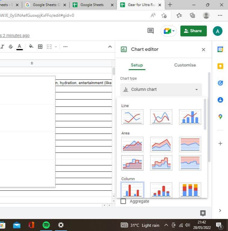
- Click the Chart Type drop-down to see alternate chart types, and then select any one of your choice
- Different chart types are grouped by category. Anyone you select from here automatically comes up on your spreadsheet using the already available data
The available chart types include bar charts, line charts, pie charts, scatter plots, area charts, and more. Not sure which one fits your data? Use this quick guide to pick the right chart type:
- Line chart — best for showing trends over time, such as monthly revenue or weekly traffic figures
- Column chart — ideal for comparing values across categories side by side
- Bar chart — works well when your category labels are long and a horizontal layout reads more cleanly than vertical columns
- Pie chart — good for showing parts of a whole, but only when you have a small number of categories (ideally five or fewer)
- Scatter chart — useful for visualizing the relationship or correlation between two numeric variables
- Area chart — similar to a line chart but fills the area below the line, making it easier to show magnitude or volume over time
Keep in mind that choosing the wrong chart type can make your data harder to read or even misleading — for example, using a pie chart with ten or more categories will result in a cluttered visual that’s difficult to interpret at a glance.
How to Customize Charts on Google Sheets
Regardless of the graph or chart type you choose on Google Sheets, you’ll get various options to customize it to your taste, from the titles to font color and title format. You can do all these right in the Chart Editor menu. Follow the steps below:
- Go to the Customize tab in the Chart Editor
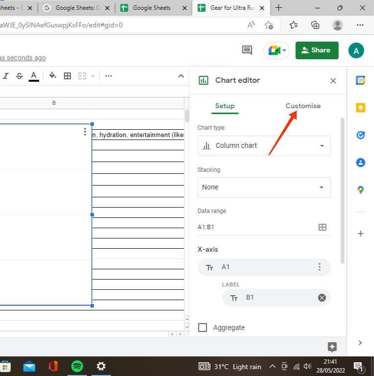
- Select Chart and Axis Titles to edit your title texts. Google Sheets automatically generates title texts from available data. Use this option to change it as you desire
- Add Axis titles using the Chart and Axis Titles drop-down. Sheets doesn’t add this one by default; thus, you can use this option to make your individual chart axes more straightforward by adding titles.
- Customize fonts and colors using the Chart Style sub-menu. This gives you extra formatting options and makes each of your spreadsheets stand out and easier on the eyes. You also have the option to change background colors, as well as border colors, in this sub-menu.
- Adjust the legend position by opening Customize > Legend. From here you can move the legend to the top, bottom, left, right, or inside the chart, or hide it entirely if it’s unnecessary for your layout.
- Edit gridlines and tick marks under Customize > Gridlines and ticks. You can add or remove major and minor gridlines on both axes, and adjust tick spacing to make the chart easier to read at a glance.
- Change series colors and styles under Customize > Series. Select a specific data series from the drop-down, then change its fill color, line thickness, point shape, or opacity. Some chart types — such as column and bar charts — also let you format individual bars or data points to highlight them separately from the rest of the series.
Taking the time to properly customize your graph ensures that it aligns with your presentation style and makes the data easier to interpret at a glance. A well-labeled, color-coded chart can significantly improve how your audience engages with your spreadsheet data.
Final Notes
As you can see, Google Sheets is just as robust as you’d expect Microsoft Excel to be. Although it has its limitations compared to the latter, the myriad of customization options regarding graphs and charts are enough to make any casual user of spreadsheets stick.
Once you know how to make a graph on Google Sheets, you’ll find it much easier to communicate complex data in a clear and visually appealing format. We do hope you find this tutorial helpful.