iOS 7 vs. iOS 6: A Look At The Major Interface Changes
Love it or hate it, iOS 7 is finally here, and if you go for one of the latest iPhones or update the firmware on your existing ones, you will have to deal with its brand new, flat UI each day.
While Android will be getting KitKat, iOS has gone the way of Hello Kitty, according to some. Jokes apart, the new interface changes are not as bad as some people made them out to be when the first iOS 7 beta came out.
In fact, the new UI is quite refreshing in most apps, and the revamped iconography as well as the overhauled lock screen have been received by many as welcome changes. In addition, the parallax effect and dynamic wallpapers are a sight to behold, too.
However, you might not be able to gauge the full array of changes just by taking a cursory tour of iOS 7. So, here is a complete list of all the significant UI changes that have arrived with the update, complete with side-by-side comparison screenshots of the same features on iOS 6 and iOS 7.
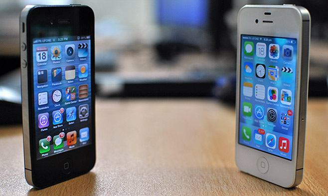
Home Screen


Lock Screen
Most changes on the lock screen are pretty obvious, but you might not notice that it is now possible to swipe to unlock to the Home screen even if there is a fresh notification there. In addition to that, you can also launch the Notification Center and Control Center from there.


Folders
Multiple pages can now be created within folders, meaning that you can put a lot of apps inside a single folder.


Notification Center


App Switcher


Spotlight Search


Apps
Camera


Photos


Weather
You might not notice it straight away, but tapping the temperature on a city’s screen reveals additional information like humidity level, wind speed, and chances of rain.


Music


Calendar


Once you hit the back button in the stock Calendar app and exit the ‘Month’ view, it zooms out to reveal an overview of the entire year.

Alarm


Clock


Reminders


Notes


Game Center

Settings


App Store


Siri


Stocks


Calculator


Contacts

Voice memo


Newsstand


Compass


The Compass app now has two screens. The first one is not too different in functionality from the iOS 6 version, but the second screen displays a level meter that is pretty awesome, and shows the current degree of tilt in real-time both visually and as the tilt angle.


Phone


Messages


Maps


Although a majority of our readers voted against the iOS 7 redesign, there are some undeniable improvements in the update, too. I personally just adore the dynamic wallpapers and the new Weather app, though some of the icons just don’t suit my taste. Feel free to make use of the comments section to let us know what you think of the platform’s latest attempt at revamping itself.

I was browsing the net to see how much the UI in iOS7 has changed from iOS6. Your article, I must say, is the best.
I see the difference with a glance and I cannot stand this hello kitty UI. If I want to look at a child’s drawing, I would go volunteer at a youth center and hand the kids blank paper and crayons.
I am an adult, I like a more detailed and real based user interface. Not a generic, child like drawings. Either give me the ability to choose the interface I like or do not expect me to buy another phone from you again. I won’t waste my time telling you not to do something, you have fans of this UI, I am not one of them and you won’t have my money until I have options.
The new IOS (ios7) looks more like a kids’ toy now. A lot of it looks like a cartoon that some kid designed. Most of the screens in Ios6 looked a lot moore professional
I agree and until I am given the option to have the iOS 6 apparence, the more adult and professional appearance. I will not buy another iPhone. At the very least, give me the option to choose themes. I AM a paying costumer, make me happy.
7 looks nice. I dig the redesigns. I must admit that it looks more like Android than ever. Not necessarily a bad thing.
They didn’t change the podcast app whatsoever…
The Podcasts app doesn’t come pre-installed with iOS, so maybe it will get an update of its own later.
Done in Pakistan ??
Yes.
Very cool side-by-side!
OK, is there any way to hide the merciless Apple spam? Jeez guys, enough with the gushing already! I’m sure the iGod has noticed you already, even though it won’t make a difference!
Every Screenshot matches. down to the last detail. Loved this