Change Color Of Cells In Excel 2010 [Color Scales]
Excel 2010 have many data visualization tools which provide best way of presenting data either in pictorial representation or with advanced conditional formatted style. Color Scales is an advance level conditional formatting which allow users to show data scaling with different colors, this will eventually make data easier to comprehend by concerned audience, as they can easily infer overall evaluation of dataset by just glancing at spreadsheet.
Launch Excel 2010 spreadsheet on which you want to show Color Scales. For illustration we have included a spreadsheet containing fields; marks in different course fields and Total.

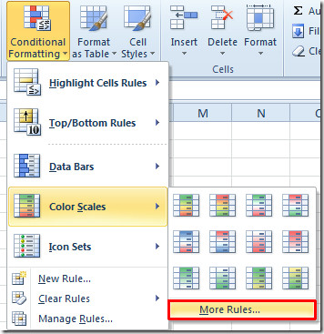
Now we will be applying different Color Scales to make the data in spreadsheets more prominent and self-explanatory. We will select all the course fields. Navigate to Home tab, and from Conditional Formatting options, select More Rules from Color Scales menu.

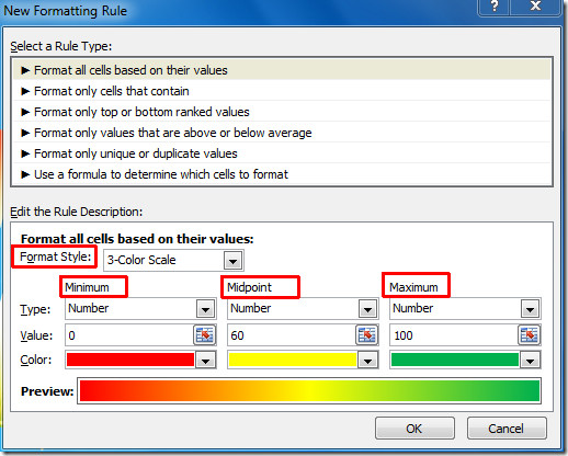
In New Formatting Rule dialog, under Select a Rule Type, choose the desired rule and under Format style, select either 2-Color Scale or 3-Color Scale. From Minimum, Midpoint and Maximum, select desired Type, Value and appropriate Color.
As shown in the screenshot below, we have selected Number from Type, entered Value based on grading rationale, and chose Color (we have selected red for minimum value, yellow for midpoint value, and green color for highest value). Click OK to continue.

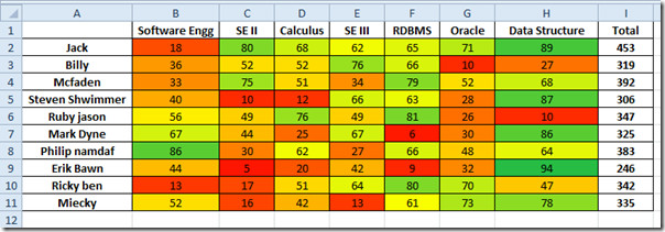
Now you will see data cells with specified color scaling.

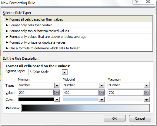
Now for Total field, we will be applying Color Scale again. Move to New Formatting Rule dialog, select different color scales for different values and click OK.

Now you will see the spreadsheet with specified Color Scales for Total field, as shown in the screenshot below.

You may also be interested in our previously reviewed guides on Excel 2010 Data Bars & Icon Sets in Excel 2010.

Is there a way to set more anchoring points that just the minimum, midpoint, and maximum? I deal with sets of data that tend to be bizarrely distributed. I’d like to fix the min, first quartile, median, third quartile, and max as red, orange, yellow, green, and blue (respectively), and have a gradient of color through each interval. However, I can’t seem to get Excel to apply more than one conditional formatting rule for the range of cells.