Fix Apple Device Safari Viewport Scaling Bug [How To]
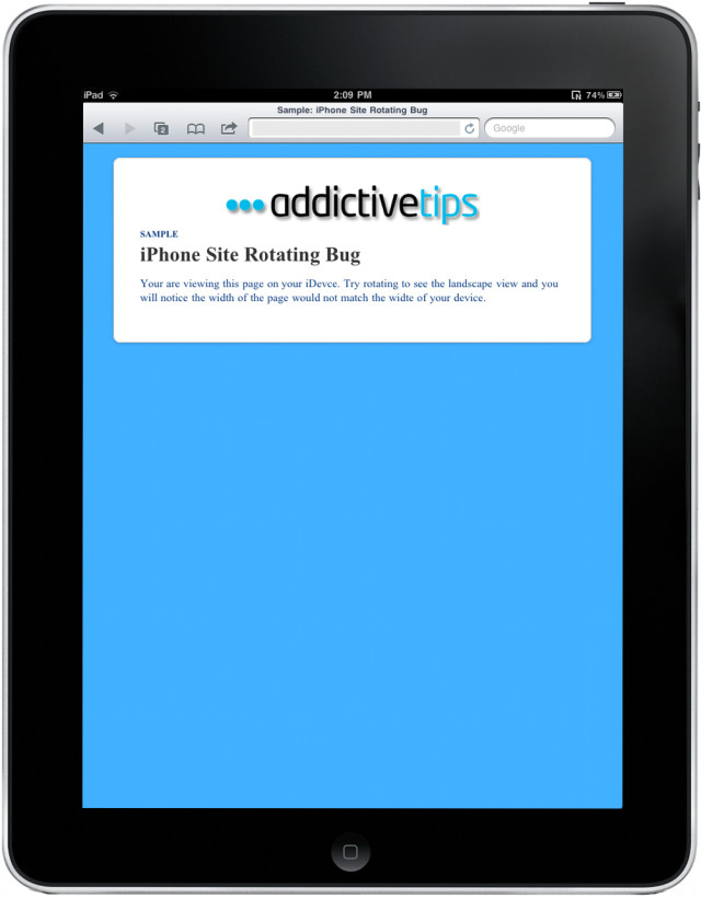
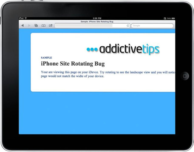
If you are a web-designer, the bug known as Viewpoint Scaling might have confronted you which occurs in the Apple devices i.e iPod, iPhone and iPad. Sometimes, when we rotate our Apple device from portrait to landscape orientation, the site zooms in, showing us a view having a width larger than the device-width. This is because the designer has set the viewport width to the device width. To help you get an idea how this bug works, we designed a sample page and rotated our iPad from portrait to landscape view.


A quick fix for said bug guides us to set the ‘maximum-scale=1’ in the viewport meta tag. This does fix the problem for the time being but the page is no longer zoom-able because we fix the maximum width similar to the device-width.
<meta name="viewport" content="width=device-width; initial-scale=1; maximum-scale=1">
This quick fix isn’t exactly the perfect solution. Through the hard work of designers like @mathias, @cheeaun and @jdalton, we now have a javascript that can be added to the <head> section in order to get a permanent solution. Under this solution, the page will remain zoom-able.
<script type="text/javascript">
(function(doc) {
var addEvent = 'addEventListener',
type = 'gesturestart',
qsa = 'querySelectorAll',
scales = [1, 1],
meta = qsa in doc ? doc[qsa]('meta[name=viewport]') : [];
function fix() {
meta.content = 'width=device-width,minimum-scale=' + scales[0] + ',maximum-scale=' + scales[1];
doc.removeEventListener(type, fix, true);
}
if ((meta = meta[meta.length - 1]) && addEvent in doc) {
fix();
scales = [.25, 1.6];
doc[addEvent](type, fix, true);
}
}(document));
</script>
These are the only known solutions that the designers have come up with so far. But if you have another one to fix this bug, do share it with us in the comments.

I usually a slightly smaller js:
$(document).ready(function(){
var mobile_timer = false;
if(navigator.userAgent.match(/iPad/i)) {
$(‘#viewport’).attr(‘content’,’width=1024, maximum-scale=2.0′);
}
});
set an id on the viewport meta tag (#viewport)
Note:
line 12: if ((meta = meta[meta.length – 1]) && addEvent in doc) {
the two HTML ascii alpha entities of the ampersand characters
&&
should be replace with the real single symbol in you code
line 12 fixed: if ((meta = meta[meta.length – 1]) && addEvent in doc) {
We Can Fixed this by this way as well.
var mobile_timer = false,viewport = document.getElementById(‘viewport’);
if(navigator.userAgent.match(/iPad/i)) {
viewport.setAttribute(‘content’,’width=device-width,minimum-scale=1.0,maximum-scale=1.0,initial-scale=1.0′);
window.addEventListener(‘gesturestart’,function () {
clearTimeout(mobile_timer);
viewport.setAttribute(‘content’,’width=device-width,minimum-scale=1.0,maximum-scale=10.0′);
},false);
window.addEventListener(‘touchend’,function () {
clearTimeout(mobile_timer);
mobile_timer = setTimeout(function () {
viewport.setAttribute(‘content’,’width=device-width,minimum-scale=1.0,maximum-scale=1.0,initial-scale=1.0′);
},500);
},false);
}
Big thanks for sharing this great code snippet!