Excel 2010: Create Pivot Table & Chart
Excel 2010 has an option of creating pivot table, as name implies it pivots down the existing data table and tries to make user understand the crux of it. It has been extensively used to summarize and glean up the data. Contrasting to Excel 2007, Excel 2010 provides very easy way to create pivot tables and pivot charts.
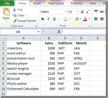
For better understanding, we will use an excel worksheet filled with simple sample data, with four columns; Software, Sales, Platform and Month as shown in screenshot below.
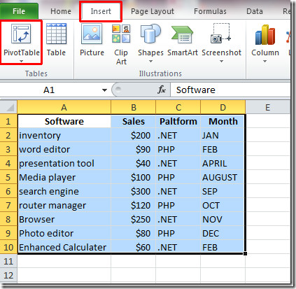
To start out with making pivot table, make sure that all rows and columns are selected and record (row) must not be obscure or elusive and must be making sense. Navigate to Insert tab, click PivotTable.
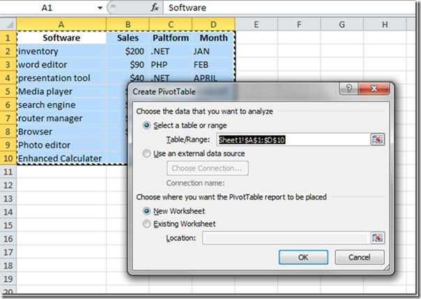
You will reach Create Pivot Table dialog box. Excel fills in data range from first to last selected columns and rows. You can also specify any external data source to be used. Finally choose worksheet to save the pivot table report. Click OK to proceed further.
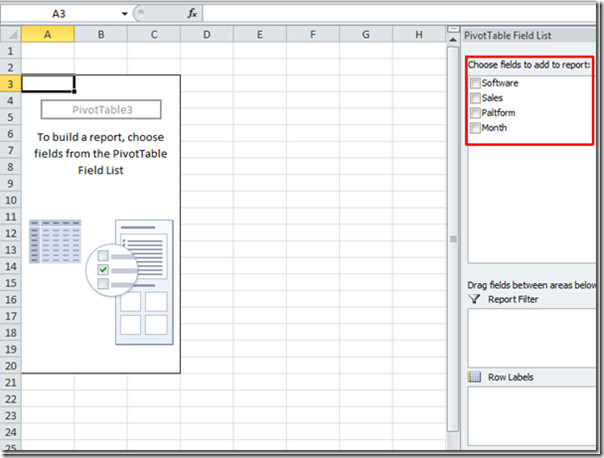
Pivot table will appear. Now we will populate this table with data fields which is being present at the right side of the Excel window. Excel 2010 has changed the way you insert pivot table when compared with Excel 2007 where dragging and dropping did the trick. Just enable the field’s checkboxes seen at the right side of the window and Excel will automatically start populating pivot table report.
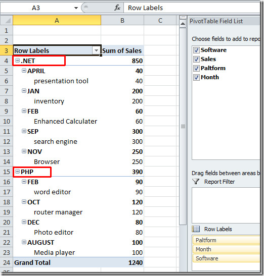
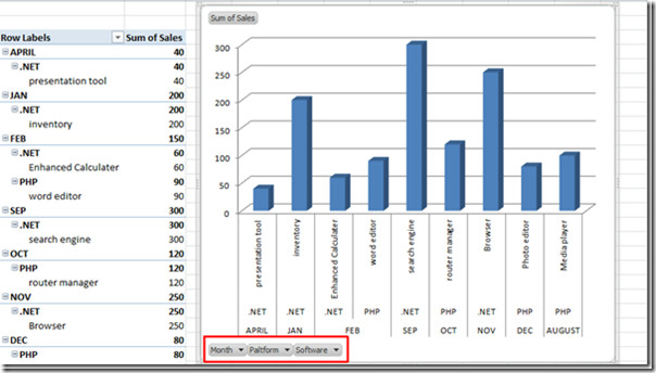
We start off with enabling Platform field, and then other fields. Excel start filling cells in a sequence you want to populate. The Platform field will come first in the Pivot Table as shown in screen shot.
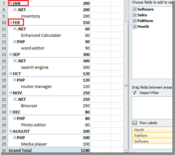
If you want to populate in a different way, just change the sequence.
For Instance: In order to summarize data by showing Month field first and then other fields. Enable Month field first and then other fields.
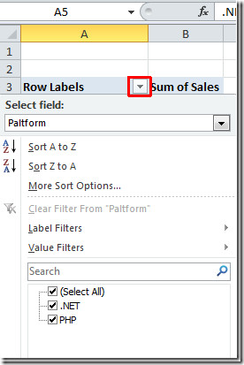
For more filtering options, click on Row Labels drop-down button, you will see different options available to filter down and summarize it in more better way.
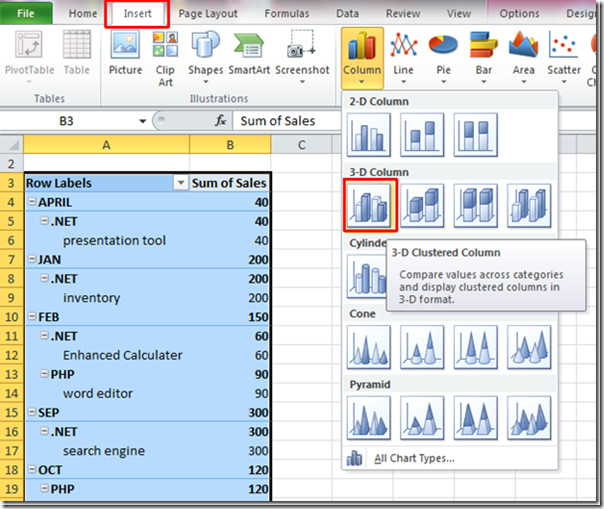
For creating chart of pivot table, go to Insert tab, click Column select an appropriate chart type. In this example we will create a simple 3-D Column chart.
Excel will create chart out of your data. Now resize it for a better view. Chart content can be changed by using the options at the bottom-left of its area.
For Instance: If we want to view software apps developed only in .NET platform, simply click Platform button, and select .NET from the its options and then Click Ok
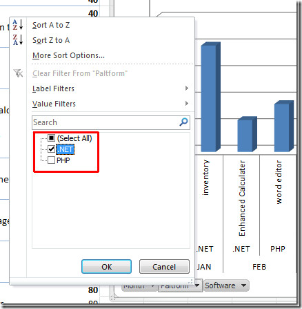
Pivot Table and Chart will only show software and month in which .NET platform is used for development.
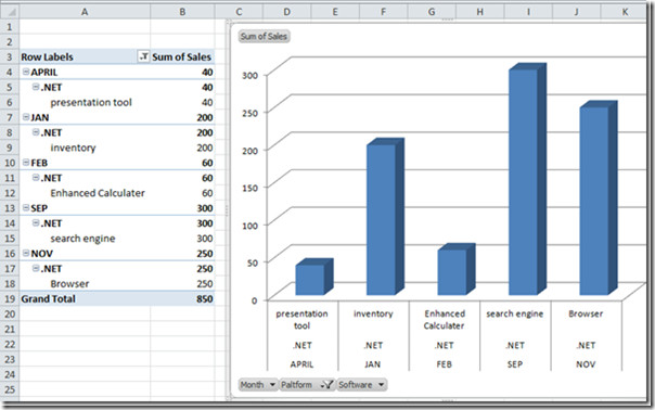
Now you can create more filtered and dapper-up charts by using pivot table report. Usage of pivot table and chart not ends here, it is an ever growing feature of excel and has endless dimensions.

Excellent article. I will be going through some
of these issues as well..
I have created a pivot table using Excel 2010 but some cells are blank, missing data! any tips please?
Too good.. thanks a ton.
Thats really great job done. Very short and very clear. Learnt very much in very less time..
This is great! Short, consice yet detailed and to the point. Great job! I learn alot from this small but enormously educative presentatios. Thank You
Thanks for the Tips. Can i get some download files?
http://tipsindeed.com/excel/complete-guide-to-pivot-tables-in-excel.html
This is great, it’s exactly what I need to do with one step missing!! In the example where you have the Platform field as the header, how would you sum all of the values underneat for each category?? Thanks 🙂
Hello Sarah,
I know it is kind of late but still, you need to move “Sales” from ‘Row Labels” field to “Values” field. This field is right to ‘Row Labels” field and is not shown on the screenshots above. Drag-N-Drop the the “Sales” row to “Values”and you will get things sorted just as on the pictures above.
Hope that helps!
-Nik