Excel 2010: Scatter & Trendline
If you have been caught up in the maze of numbers and values all day long in Excel, then it would be fascinating to create scatter graph for your datasheet. With Scatter graph & Trendlines you will be able to grasp the trend of your data. With this data visualization tool you can help your audience to understand the crux of the datasheet by visually conveying them what data actually means, and most importantly help them to comprehend the trend of your datasheet values. This post will put some light on it.
To start off with, launch Excel 2010, open a datasheet for which you want to create Scatter graph and Trend lines.
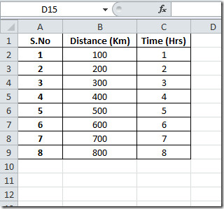
For instance, we have included a datasheet for which we want to create scatter graph and trend lines, it contains two fields; Distance (Km), and Time(Hrs).
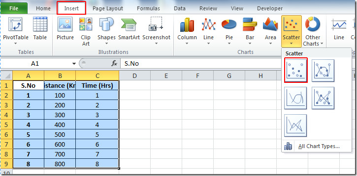
Now we want to create scatter graph which will show distance and time relation. For this, select the portion of the datasheet, navigate to Insert tab, and from Scatter options, select desired type of chart as shown in the screenshot below.
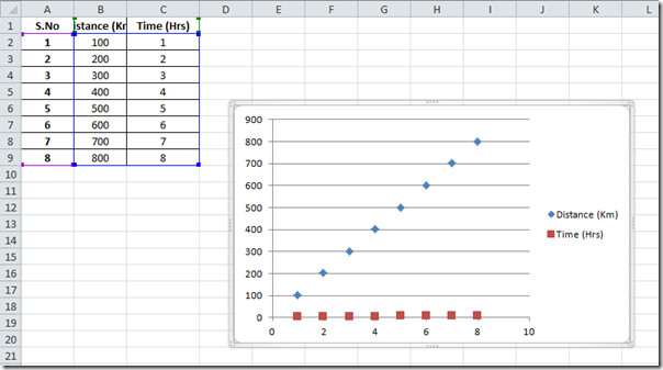
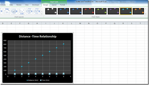
Upon clicking desired type of chart, Excel will automatically create a chart, representing table fields as x-axis, and y-axis respectively, as can be seen in the screen shot below.
Now we will change the layout and design of the chart to make the value and scattered dots more prominent. For this select the chart, and you will notice under Chart Tools Design, Layout, and Format tab will appear. From Design tab choose the colors and design that best suits your datasheet. From Chart layouts select an appropriate layout for scatter chart.
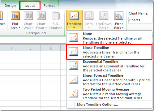
Now navigate to Layout tab, and from Trendline options, click Linear Trendline.
You will be asked for which field you want to make trend lines, select the field, and click OK. Here you can see the trendiness, showing trend of the datasheet table in the screen shot below.
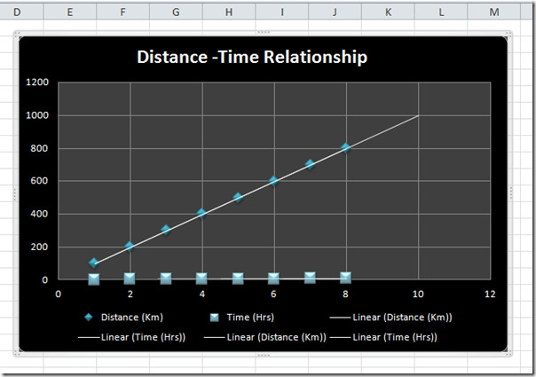
Now if you want to know the trend exponentially, from Trendlines click Exponential Trenlines.
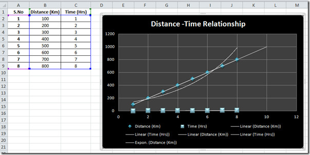
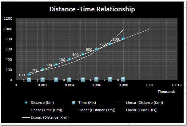
From Layout tab, there are so much to do with scatter chart; you can create Error Bars, change Plot area, apply 3-D effects, Grid Lines etc.

Apply desired Error Bars, 3-D effects, and gridlines to make the chart self-explanatory.
You can also check out previously reviewed guides on COUNTIF Function in Excel 2010 & Adding Outlook Mail Tool in Excel 2010.

Worthless chart, but at least it kinda confirms that I’m not the only one who has trouble getting the scatter chart to do something useful…
and the worst explanation on how to make it work…
This is the least-self explanatory chart I’ve ever seen.