Comparative Histogram In Excel 2010
Charts are one of the most eminent feature in Excel but sometimes you need to use them in a different way. We will try to make a Comparative Histogram out of the table data which is quite unique from the rest of the charts. In this type of Histogram, we compare two sets, or groups of data using horizontal bars, so our main emphasize will be on horizontal bars in the chart. If you will ever need to make a chart out of your spreadsheet which contains two sets of data, then this post would come helpful.
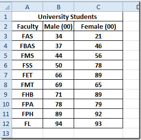
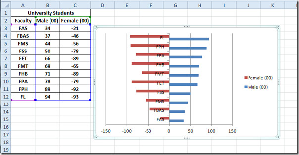
Launch Excel 2010, and open spreadsheet in which you want to make a histogram for your data table. For instance, we have included a spreadsheet of university students, containing columns for each gender, as shown in the screenshot below.
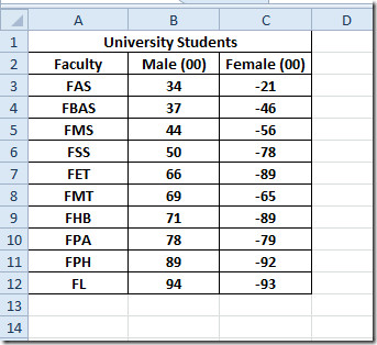
For making comparative histogram, we need to convert values of one field into negative values. We will convert Female column values into negative, to grasp a good look at Histogram.
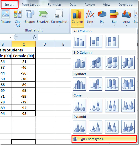
Now select the data range for which you want to make chart and navigate to Insert tab. From Column, click All Chart Types.
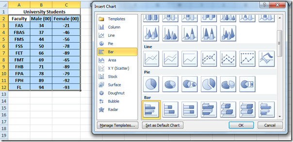
You will reach Insert Chart dialog, from left pane select Bar, and from right pane select the bar chart you want to insert. Click Ok to continue.
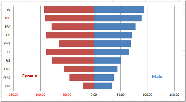
You will see the bar chart, inclusion of negative values played a vital role here as it does not depict orthodox bar chart. It is spread from X-axis to –X axis, allocating each gender one X-axis, as shown in the screenshot below.
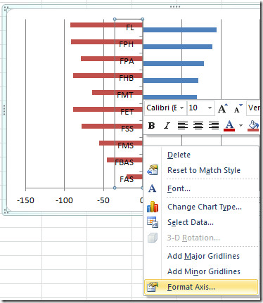
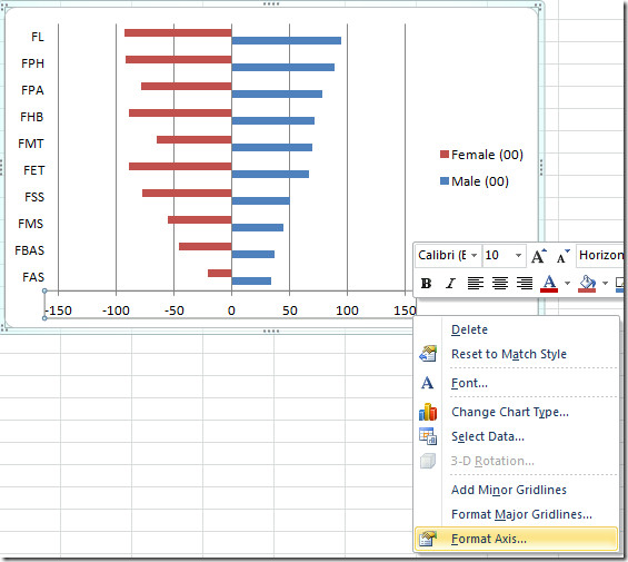
Now we need to make some changes to make the bars and values prominent. We will be adding Legends at the both sides of chart and remove negative values in X-axis. First we need to set the Y-axis of the chart at the left side. For this select the Y-axis by clicking upon any value in it, and right-click to choose Format Axis, as shown in the screenshot below.
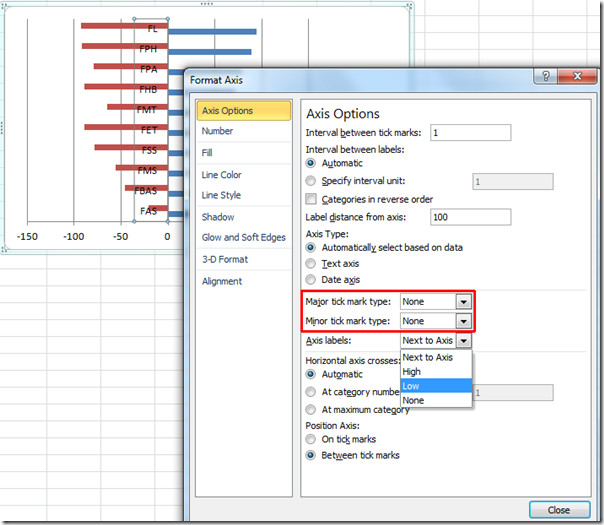
Format Axis dialog will appear, now from left pane, select Axis Options, and from right pane, choose None from Major tick mark type and Minor tick mark type, from Axis labels select Low. Click Close to continue.
You will see the Y-axis labels is now set at the left side of the chart.
Now select X-axis to format it for removing negative values. Right-click it and select Format Axis.
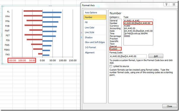
From left pane, select Number, and under category select Custom. Now from Type, select one that states [Red], upon click you will notice the negative values in X-axis change to red. Click OK.
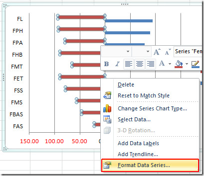
Now right-click bar and hit Format Data Series.
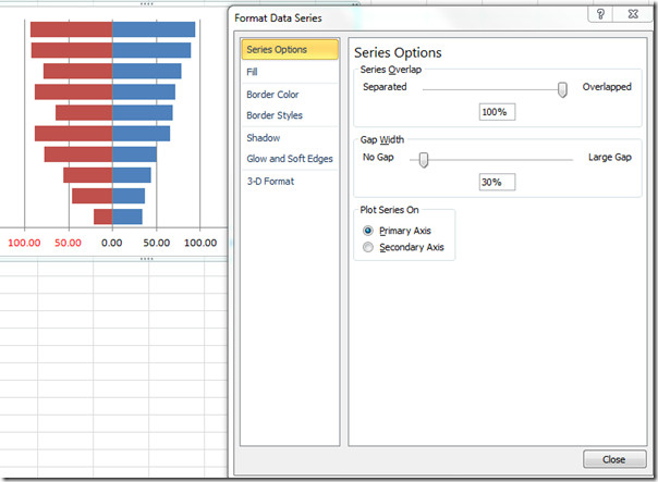
Format Data Series dialog will open up. Now select Series Options from left side, and from the main window, under Series Overlap, move the scroll bar to extreme right, to make it 100% overlapped. Under Gap Width, give it 30% gap. Click Close to continue.
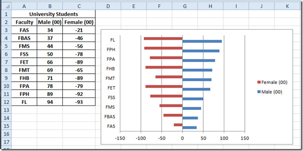
Now remove the Legend by selecting it and then pressing delete on keyboard. Navigate to Layout tab and click Text Box.
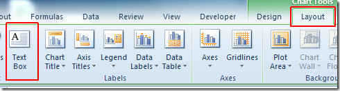
Insert text box at the both sides of X-axis to mark Male and Female respectively, as shown in the screenshot below.
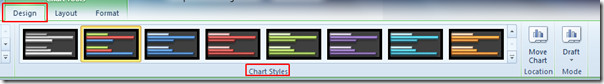
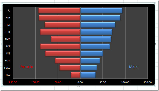
You can always apply suitable style and design to add eye-candy to the chart. From Design tab, and from Chart Style group give chart a suitable style.
You can also check out previously reviewed guides on Creating Pictograph in Excel 2010 & Using Scatter & Trendline in Excel 2010.

Saved my life for my lab report. Thank you so much.
ive been looking for a trick to do this bar charts for ages. thank you so much tht was extremely helpful
Thanks!! very helpful!! Do you know how to do it with 4 series instead of 2 (two on the left and two on the right?)
Thank you very much.. your tutorial saved my final presentation!
Thanks! It really helped. I don’t know why Microsoft has not made it a template which would have been much better than this. Anyway Thanks!
Thank you so much. This was just what I was looking for!
Gusy, this isn’t a histogram…it’s a bar chart…