What’s New in Windows 8 Desktop, Start Search & Start Screen (Review)
Windows 8 comes with a huge array of new features, Metro UI-based elements, Metro Full Screen Apps, and many other improvements. Amongst all the UI-related enhancements, native utilities and features, Windows 8 Desktop, Metro Start Screen and Windows 8 Search are the most significant. These Windows UI elements have been totally revamped with new metro look, accompanied by some new and interesting features. In this post, we will excavate deep into features that these major Windows 8 elements have to offer.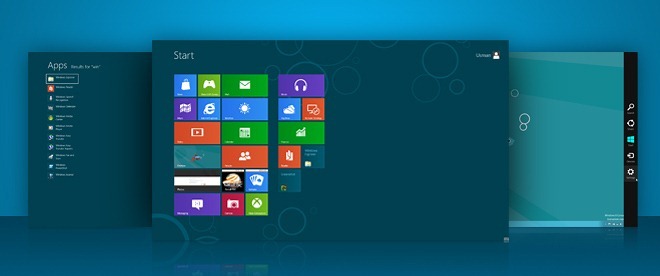
This guide is a part of our series on detailed coverage of Windows 8 New Features and Improvements.
- How To Install Windows 8 On VirtualBox
- What’s New In Windows 8 Desktop, Start Search, And Start Menu (Currently Viewing)
- The Complete Guide To Windows 8 Explorer, New Ribbon Tools And Options
- The Complete Guide To Windows 8 Task Manager, New Features And Options
- Windows 8 PC Settings [Complete Guide]
- How To Refresh Or Reset Your Windows 8 PC [Complete Guide]
- All About Windows 8 FileName Collisions And Copy/Move Dialog Box
- The Complete Guide To Windows 8 Startup Menu
- Sync Windows 8 User Settings Between PCs & Tablets via Windows Live ID
- Quick Overview Of Windows Lock Screen
- The Complete Guide To Windows 8 File History Backup
Windows 8 Desktop
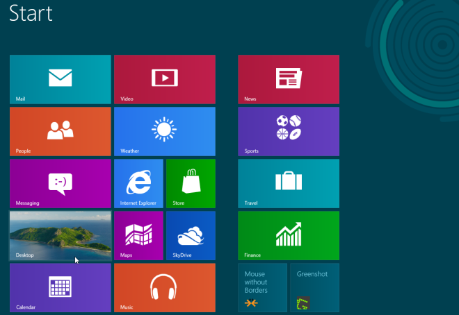
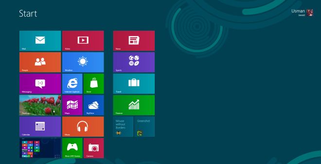
In contrast to Windows 7, which loads desktop after booting the system or shows login screen (if enabled), Windows 8 greets users with the newly designed Metro Start Screen. Inspired from Windows Phone 7 Metro UI, the Windows 8 Start Menu displays a list of default and custom metro tiles, which act as a shortcuts to Desktop, Control Panel, Windows Explorer, Weather app, RSS, Windows App Store, Internet Explorer, and other installed applications. To launch the desktop, click the Desktop tile, present underneath Video tile.
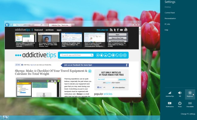
One thing which you will immediately notice when you open Windows 8 desktop is that there is no Windows Start Orb. When you hover mouse pointer over the bottom-left corner of the screen, it shows the thumbnail preview of Start Screen. Clicking this thumbnail takes you directly to Windows 8 Start Screen, allowing you to launch Metro apps and pinned applications, and Windows Explorer shortcuts.
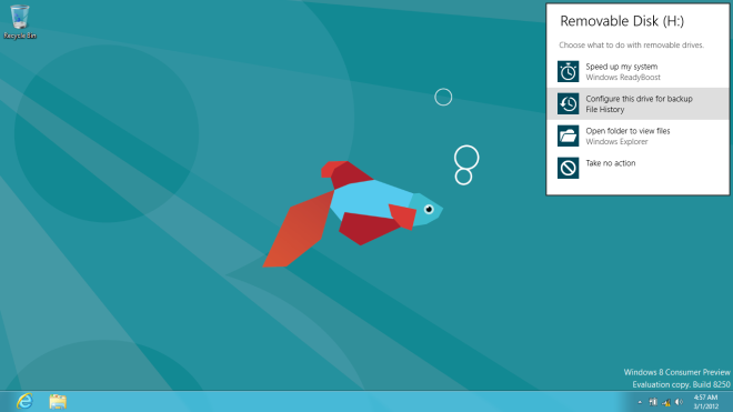
Windows 8 Desktop has a lot of hidden UI elements, which can only be seen with their associated application and functions. For instance, when you plug-in an external storage device, you will see a revamped, new storage device found, metro-based auto-run pop-menu over system notification area. It lets you open the folder, use the device to speed up the system via ReadyBoost, or configure drive for backup.
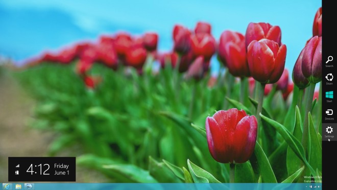
Windows 8 Desktop view and Metro Start Screen let you open Charms bar – a right-side bar menu that gives system-wide access to Search, Sharing, System Settings and Basic Actions. Just move you mouse pointer to bottom- or top-right corner of the screen, or use Windows+C hotkey combination to access the charms bar. It also shows the current time, day, date, internet status and battery level at bottom-right side of the screen.
Windows 8 Settings pane (accessible from Charms bar), contains not only power button options, such as, Shutdown, Restart, Sleep etc, but also many shortcuts to system-related settings including, Network, Volume, Notifications, Screen Brightness, Power, and Notifications.
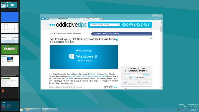
Perhaps the most interesting aspect of Windows 8 Desktop is Switch List (accessible from the left sidebar), which is by default hidden, but when you hover mouse pointer over top-left corner, it shows all active Metro apps. This left sidebar makes it easy to quickly navigate between all applications running in the background.
Windows 8 Start Search
Like Windows 8 Desktop Settings pane, Start Search can also be accessed from charms bar. It contains some pre-defined categories like, Apps, Settings, and Files, along with a list of installed applications to help you quickly find and launch an application.
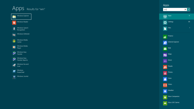
Unlike Windows 7 search, which shows results in Windows Explorer when Enter key is pressed, Windows 8 Search extends the Search pane to whole screen area, allowing you to view filtered search items from pre-defined, as well as, custom search categories. Apart from opening files/folders, and launching applications, you can right-click the application to run the application as administrator, open new window, open file location, and Pin to Taskbar and Start Screen.
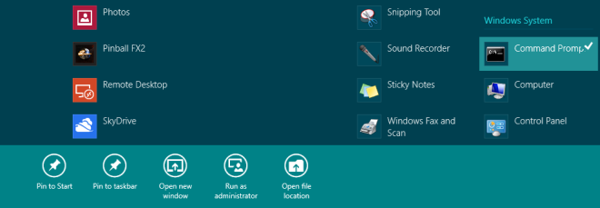
In order to perform online search, you need to sign in with Microsoft account. Just enter the keywords you want to search and hit Enter key to let Windows Search fetch results from online sources. However, you can view Bing search results for specified search keywords by clicking Internet Explorer.
Windows 8 Start Screen
If you were to pick and bring together all the important Windows 8 system components along with Windows Explorer, Desktop, Installed application, Task Manager, widgets, etc, under a unified interface, you’d end up having Windows 8 Start Screen in front of you. Windows 8 Start Menu is designed keeping the need to access your PCs different elements without having to open multiple Windows Explorer windows. By default, it contains Internet Explorer, Desktop, Windows Explorer, built-in full screen application shortcuts, Task Manager, Computer, and other numerous widgets, you can pin as many applications, folders, shortcuts, custom widgets as you want to Windows 8 Start Screen.
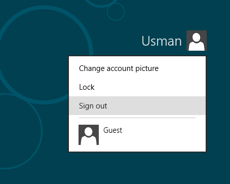
Like Windows Phone 7 native application launcher, it lets you change position of application tiles; just hold the tile which is to be repositioned, and then drag it over the required area of the screen (see our detailed guide on modifying tile behavior). The scroll bar present at the bottom will help you navigate through the Windows 8 Start Menu interface. When you click User Tile, it will let you log off, lock the screen, add new user and change the user tile from personalization window, where you can change picture, change color, and apply other customizations.
That’s it for now. The features and options related to Windows 8 Desktop, Start Search, and Start Menu will not only help you manage Windows 8 Desktop apps and Metro-based Full-Screen applications, but also access system utilities and settings. We’ve tried to cover the most salient aspects of Start Screen, Search and Desktop. If you think that there is a feature worth adding to the list, let us know in comments.


What a bunch of cry babies and, it seems MSFT bashers. Gosh, something new and great comes out and some folks complain that MSFT can’t design and create a UI or OS that is able to read everyone’s mind. Give me a break. Been working with computers for 33 years and each upgrade brings new ideas to the table. Win 8 is one of those. Have you missed the fact that with SkyDrive on all your systems all files can be synced? Sure new users have 7 GB, but that’s more than anyone else is offering. I was able to maintain 25GB of cloud storage through grandfathering. Tiles-live or not-are show an innovative, modern look and function. Sounds like Jack Nickalus complaining that today’s modern golf ball goes too far.
Been using Windows 8 for about a week now and I absolutely LOVE it. It has loads of really nice little features that have been thought through very well and if you luddites would just let go of your start menu drivel and learn how to use it (Start menu, right click, admin tools etc etc) it really is much slicker than Windows 7. I will grant you that it requires a bit more personalisation and customisation but guess what, you do that once on one machine and everything replicates to any other machine that you log on to. Windows 8 is awesome and I really wish people would use it properly before commenting. It’s like anything else, it’s different so your scared and things aren’t where they used to be but the point is that Microsoft has analysed the usage of Windows 7 and made Windows 8 more efficient and more responsive to how you as an individual use your machine.
It has its issues like every other OS in the world but on a desktop it still works great both for a user and an administrator. For a tablet it’s going to be out of this world.
Win 8 interface looks most like a toybox for kids. I will stick to the Win7 for as long as possible.
Suggest that Microsoft makes two interfaces for Win 8. The current childish on and another on for more advanced IT users who use a pc as tool rather than a toybox. And by the way make the Ribbons optional so one could use the old dropdown menues and crisp and clear icons. Have a look at Softmaker Office 2012 and you will se what I mean.
I don’t know anything about the Windows 8 and Windows 7 application compatibility. Maybe someone could explain that in some of the posts. If Windows 8 supports Windows 7 apps fully, I’d probably switch to Windows 8 on my Toshiba Netbook.
Great!
Now I definitely know I’ll never buy any windows product ever anymore!
They can exchange my worthless Vista to a 7, but the only thing I was looking forward to in win 8, is getting rid of that ugly metro looks!
Now that the only alternative, the desktop view has been crippled even more, they can forget about me buying their product for good!
Disgusting, and totally unwelcome My $hit company of my a$$!
Im sorry but can someone explain too me how people say give it a chance, once you get used to it blah blah blah. Seriously get your hands off M$ DiKs. Now i have spent a few hours experimenting with the windows 8 preview and unless the release covers my issues then i stand with my hate for it. Apart from the metro crap, i actually like the desktop version, aswell as the integrated features like iso mounting (even though i use daemon tools, I still prefer a standalone installation with everything available without having too fill the holes myself) and explorer ribbon (which some may not like, honestly i don’t see the harm in this) etc.
BUT where are our options these days? why do i feel that my pc “Personal Computer” needs too be sand-boxed or restricted in some ways? This is in regards for an OPTION too turn off Metro and revert to the highly successful “old” start menu. Honestly imo, dont turn something into something that it makes, meaning the computers coded those tablets, TV’s, phones, Consoles etc. UI. Even just an option to boot straight into desktop mode seems too much too ask for wtf? BUT hey these days everything is touch… MMMM, go write a 10 page essay the tell me if your arm doesnt hurt in any ways. Then again just talk on the messenger app or fb with your arm stretched out to a touch screen monitor (which i doubt many ppl have for pc’s) that’s around 20 inches away or so and see if its either quicker or comfortable than the famous KEYBOARD. Its obvious the metro targets touch, which seems pretty stupid for a home pc user.
Now with the amount of ram, infinite power, HDD space and upgradable components that a pc has access too. why would you make it feel linear? meaning FULL SCREEN 1 app at a time. So what happens if i was too talk to someone on messenger and we were talking about products on a website? what if i was to play a metro game then i get a message and want to know if it worth replying to or leave the game for? What if i want to review a written notepad to refresh my memory for something i was doing? What if i want to calculate some values from somewhere? it all seems that i have to close different apps etc to get where i need, even then thats not helpfull as im a heavy user and i do alot off things at once which not only clutters my mind but will also have me stumbed in what I was doing through metro. Unlike task bar where i can visually see straight away what my my pc and I were doing. Also have messenger to the right and another app on the left and reply if needed, change music track without losing train off thought.
I also was surprised by the new media player, 1080p screen with a fullscreen music player and just a couple off buttons and no visualizations etc lol. To even log in, we have to click hold and drag just to be prompted with a password then type and press enter, TO MUCH! then the default settings is actually inside metro and not control panel, now that too me doesnt feel pc at all! We then get told by, if you dont like it then stick with win 7. But we have these small features that we like that win 7 doesnt have. Honestly the biggest flaw is metro which hasnt allowed us an option to turn of or default startup to normal desktop and just clicking start should be cluttered with my 2 year olds blocks. Just the convenience off seeing what i was doing and click start then open what i needed relative to whats on screen is just standard. Instead we are blown away with a full screen metro UI blocking our train off thoughts. OHHHhh and to you metro lovers, is your lives that boring on pc that you dont mind waiting for apps too open and not be able to do anything else?
To top this off why do you think they did the metro? why do you think they made it the first thing you see etc? $$$$$ the hungry bastards. if they make it standard and highly acceptable, they get revenue for every sale from there metro store. Its not about the consumer anymore. I had always had respect for M$, I got a xbox over PS2 i got the 360 over PS3 or any other console just because it was m$. But now i couldnt care less, the 360 itself is just as bad, and to the other ppl and about the kinect and its success. Lets face it, whats available and the hype, its a huge flop! it was marketing techniques that got theres sales but i can assure you that 99% off kinect owners are dissapointed with whats out for it. we mostly bought it on lauch to find fu@k all games that can even code for it properly.
You all should take a look into linux… so much better than ms stuff.
what is the new features in window 8 as compare to window 7 & window vista
plz explain clearly
i want windows 8 to not be full screen
well, this just confirmed me sticking to Mac..
I hate mac and apple, but I can understand why…
Windows is going at becoming the most useless company ever!
They better keep 7 alive if they still want to sell something.
Businesses and windows users don’t want the ugly 8!
There has been some improvements then the Developer Preview, but I am still not impressed with Microsoft about what they did.
This is really bad. BAD BAD BAD. Lookup bad in the dictionary and you will see a picture of steve ballmer holding a dvd with windows 8 on it. And that music on their marketing video??? BAD BAD BAD. Bad marketing people with too much money run amok. I don’t see ballmer making it past summer of next year. Awful BAD!
It’s amazing buddy!
Looks like a downgrade. The whole idea of touching a screen seems like a huge step backwards. I mean, do we really want to smudge our screens with fingerprints? I don’t. If this is the future, I’ll be sticking with Windows 7 for a long, long time.
Crappiest UI ever. The colors make me feel like I’m in elementary school. I want control over what I want to see on my desktop, not what some developer thinks “relates” to what I just plugged in or I am using. I use multiple applications simultaneously, hows it going to show that?
If this was meant for pcs and laptops, they should just start over. I dont think it was built for that tho, they are trying wholesale to get into the tablet market that apple is dominating and dragging us all along w/ a crappy UI meant for tablets (jury will be hung on whether the OS itself is any better).
Who ever thought this direction (UI/color choices) was good, from where they have been.. should be fired. Only reason to use it, imo, would be because M$ make you upgrade by discontinuing support for your OS. Its a perfect time to look at alternative OS’s.. IOS tablets or Ubuntu (etal) for PC’s and laptops. Dont buy into the hype for crap design and shell out the $$$ when there are free and better designed and built OS/UI’s.
I dont plan on using this p.o.s until I absolutely have to..(read: forced to)
It doesn’t appear to be an improvement on windows 7. Judging from some of the comments it doesn’t appear to be user-friendly either. I can’t see a reason to upgrade from windows 7.
Ok… Installed it on a backup computer (Thank God!)
So, Fast Boot up??? Hmmm Running from an SSD, 14 seconds to boot up… Windows 7 was 11 seconds….
Mouse navigation? What mouse? Apparently my mouse, or should I say Mice(?) don’t exist….
Metro UI, ugly as a dogs regurgitated meal…. I have 40″ monitor with big ugly squares all over it….
What toddler dreamed this up?
Cloud like features? Not good if you have caps on your internet usage…
So far, so very, very, unimpressed…
it is very good window. i like it. it starts quickly.
The new UI makes me sick. Not to mention unity, which I am now sickeningly reminded of. It’s like steve has sent out drones to all the devs and is trying to ruin the concept of a UI for everyone, and dumb it down.
So sad, this new windows OS version is inspired on tablet’s OS. I’ve been watching some videos about the new features of windows 8 and all they are about is tweeter native integration and stuff like that. PCs are for so much more than that, whats the point of having high frequency multicore processor, considerable amount of RAM, high storage drives in common PCs for just tweeting. If you really want to probe your new system is faster than any, run some real benchmarks, try some heavy numerical calculations and post your results. The reality is that windows in never going to be the fastest, but most of the software releases are for windows platforms so there is no real chance of full transition to another operative system.
Wow, the start menu is so shiny, it makes the desktop look really old and dated… It may just convert me back from linux… no, unless I get suddenly wealthy, that’s not likely
I don’t see why people are complaining about the interface. It’s about the same thing, instead of having your desktop empty with a big picture in the background you now use the space efficiently with shortcuts. As long as developer make great apps this interface will be awesome. They are making something that look very very intuitive.
So UI elements which are hidden unless we mouseover some “hotspot” with no visual indication that there is anything else. The number of people who can’t figure out how to shut it down proves it to be anything but intuitive.
A desktop full of boxes does not equal a desktop with a nice image. Unless you go away from metro and back to the traditional non-metro desktop will you get anything close to windows 7 or prior.
More screen space yes, but at the expense of usability.
Usability is about knowing what something does, and where to find what you need.
Whatever MS try to tell us, it is obvious that they are trying to put a portable device UI into a PC, which simply does not work.
Even Apple realise that in the UI on an Ipad/IPod not being the same as their Mac PCs. Because one does not work on the other. Simple as that.
Unfortunately I installed this Win 8 on my home laptop and I am still struggling to do my regular work. Can some tell me few very basic things –
1) After opening an app in full screen, HOW TO CLOSE IT … yes i couldnt find a way to close the full screen app on laptop. Esc key doesnt work, neither Alt+F4 key combination to close it. I dont see any close button on any of applications. Only option i m left with is to go to my desktop > open Task Manager and kill the app. What is the normal way of closing a full screen app on a Win 8 laptop.
2) How to access System Tools using this stupid start menu.
I can’t imagine how Microsoft believes that we can do regular (or development) work on this OS. 🙁
1) Those “full screen” apps or Metro apps are not meant to be closed. They are instead “suspended” when inactive, supposedly using no CPU when not used for a period of time.
A questionable design choice again taken from portable devices, and one which has no place on a traditional PC.
what are you going to do if a program hangs (freezes into an eternal loop)?
You can’t turn it off, it’s consuming battery as much as the cpu will draw out of it, and you’re stuck in a window where you can’t force it to close!
M$ $ucks!
to close just put your cursor on the top a hand will appear and flip it down it will close
Oh!! (slaps forhead) that’s intuative!
Maybe I was being dumb, but I couldn’t even figure out how to shut down my laptop after install windows 8… I really want it to be awesome, but I was a bit annoyed by the navigation with a mouse (how the hell do you even go back? I just kept using the escape key!)
How to disable the left side bar hover?
So this is the almighty Microsoft, attempting to make people use something obscenely different to what they have been used to.. How many times have they done that now? Oh plenty!
And no offence, but this has to be one of the most confusing reviews on addictive-tips I have ever encountered – however, this could be my eternal loathing for anything Microsoft based.
At-least us Linux users get to have the computer do as we tell it, much like OS x (since thats Linux at core anyway). Like another commenter said above/below, we want what we are used to. Reminding me of Gnome3 and Unity, something Ubuntu got very arrogant over. So I cleaned my act up and went fresh, Mint style – its beautiful, what Ubuntu should still be.
Seriously though, this looks like some kids comic book, or some special-needs user interface. As mentioned, its the phone/tablet interface, not a desktop! There is no need to run everything in one ugly looking window; if that hangs, does the whole lot go-bye-bye? Tablets are designed to be used in a different way to desktop, end of. Dony merge them ffs!
Good luck Microshaft! all money- no passion
Just a word … don’t compare to OSX and iOS since they are going the same way. Heck, they are even worse because they are even going to remove the file structure and already on iPad it is a nightmare to send attachment through email because of their proprietary file system which does NOT allow apps to see each other’s file unless specifically authorised. 🙁
ugliest inteface ever.. was win8 built by the Windows M.E. team? Yet another reason not to update and wait… skip M.E. skip Vista.. skip Win8… they are good at repeating failures.
If it was a good interface.. why is almost everyone on the internet posting tips to disable its features. If i need it to look like win7 still, i have an idea.. stick w/ win 7 and save the development costs until redmond can have a genuine idea that doesnt invlove fisher price looks.
Ballmer may tout 500,000 dl’s.. but i’d bet 400,000+ were just to see what failure looks like from redmond.
Win7, Unbuntu (or pick your favorite flavor of linux), Android and Apples OS all beat this… glad I tested it on virtualbox first. Easy to undo and forget about it.
After using OS X Lion since it came out, and a full day of Windows 8, I’ve come to despise full screen applications. At Least you have the option to maximize instead of go full screen in Lion. I hope the released Windows 8 does as well. I need my task/toolbar or whatever you want to call it. I want to see what’s going on with my computer, not just a single application. Granted, 80% of computer users are really just consumers, so they are well served by this tablet inspired nonsense. For those of us who use a computer not just to consume content, we need more.
And IE 10, seriously, it might be great on a tablet, but I really hope when the real thing comes out, Microsoft realizes we want bookmark menus and VISIBLE tabs in a desktop browser. And also, a way to turn the damn browser off. I can’t stand having to take the time to close every tab by hand when I stop browsing, just so I don’t have to wade through all the crap everytime I use explorer. Luckily, Firefox seems to work really well in Windows 8.
How does the left sidebar behave with the Taskbar moved to the left side of the screen? I move it to the left side to get more vertical space on 16:9 screens.
I must admit – I’m pretty disappointed… I thought, that Windows 8 would still be a PC OS but as it seems, it basically is a tablet OS with added PC capabilities which in my oppinion is pretty much crap becasue many functions are only available with touch gestures (and I don’t have and don’t want anything with touch on my desktop, that’s what I have a smartphone for).
I guess I would have to get used to the new start menu as it’s really a big change (which I don’t think many “older” users will like).
I love the explorer changes though, they were really necessary. Though it’s really sad that if you turn off the metro UI, the explorer doesn’t work in ribbons anymore ^^
After my testing in a virtual machine I encountered various (normal) lags – it’s a VM after all, but the OS feels much faster than win7…
I like Metro UI even on a regular PC but getting to the hidden UI elements might get tiresome (although I’m stil enjoying the movements now).
I think it would have been better if they had released two versions of Windows 8. Still build upon the same fundations and compleetly able to share apps with each other but with different interfaces.
The desktop version would than also have the metro design language but implemented in the traditional desktop. You’d have the high functionality of Windows through the taskbad and a startmenu. However the whole UI would be presented with the no-nonsense clearity of Metro (so no aero). The ’tiles’ could also be on the desktop (and replace shortcuts) and offer the same functionality as on the Metro UI.
Basically it would have the tiles and other good features of Metro UI without the touch interface commands like the charms and the need to swipe through the tiles. Just all tiles on one high resolution screens with quick on-screen functions such as the taskbar and windows explorer.
It is strange indeed, I was totally willing to adept to Metro UI (even on PC) but the WIndows 8 desktop has suprised me. It is fast and much easier to get around in compared to Windows 7. Perhaps Microsoft will release a ‘pro’ version for office work in the future that has diminished Metro features.
Of course you don’t have to upgrade to Windows 8 if they don’t offer this. They’ll still support Windows 7, but after having experienced the desktop in W8 I can see why someone wouldn’t want to go back to Windows 7. But for those that absolutely hate Metro they can just stick with W7. It is still a great OS and if Metro isn’t able to convince business users than no doubt Microsoft will find a solution. So just wait out the Windows 8 storm and get Windows 9 instead.
I personally can’t wait to purchase a Windows 8 tablet in the future. I don’t do much productivity work at home anyway. If only they’d upgrade to Windows 7 at work… they’re still stuck with Vista.